Time:
1 Year
Role:
UX/UI Designer
Tools:
Figma, Adobe Photoshop, and Adobe Illustrator
Go To Appstore
Overview
Founded by Diego Salvatierra, "Say!" is a language learning app that guides users into building their own unique sentences using AI. By reinventing the digital language learning from the ground up, users will no longer have to memorize useless vocab.
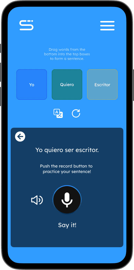
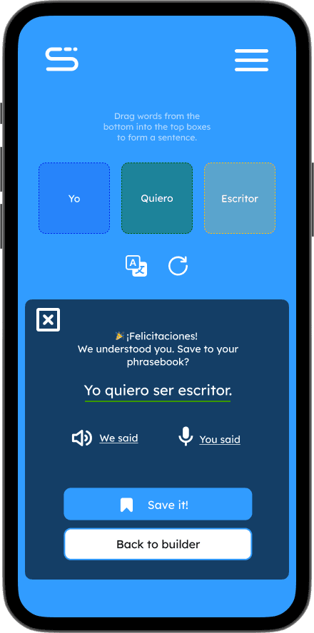
With Say!, users are able to learn foreign languages based on how they want to learn it. AI technology like ChatGPT is incorporated into the app and generates grammatically correct content. The user can test their pronunciation on words and is checked through Whisper. Completed sentences and words are saved into the phrasebook.
My Role
I was asked to deliver a new design proposal for the app. Including a system of colors, fonts, icons, and other design artifacts necessary. I took responsibility into redesigning multiple screens following the previous structure presented to me.
Impact
I created satisfying screens and a strong design style guide to push the Say! application in the right direction. With the new visual presence, the app can be progressed further into development. As a result, we saw a jump in user retention from 13% to 22% throughout the iterations.
UX Research
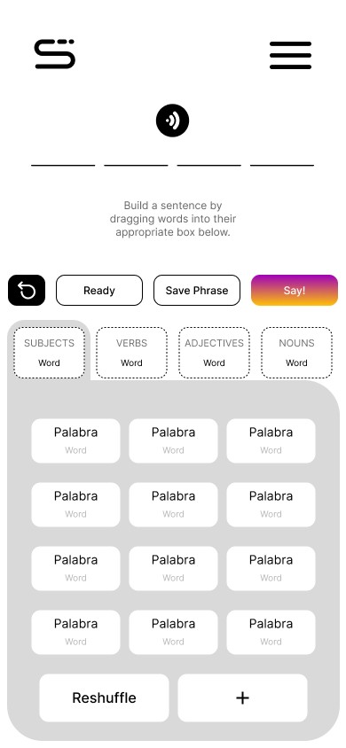
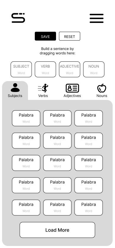
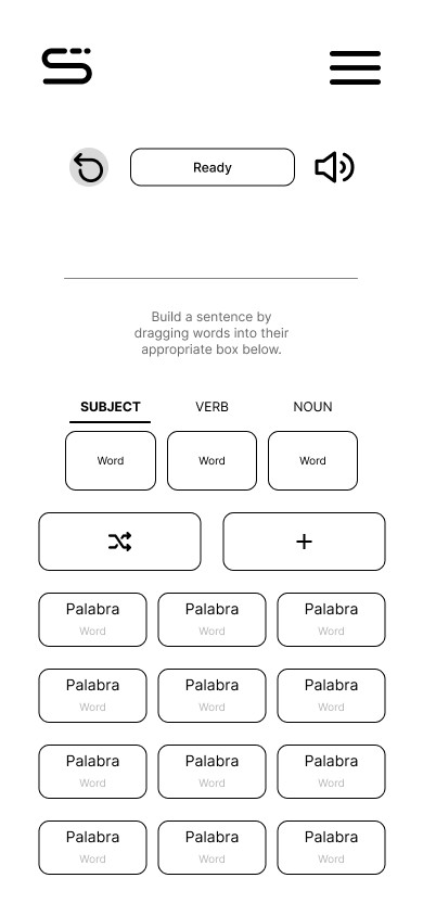
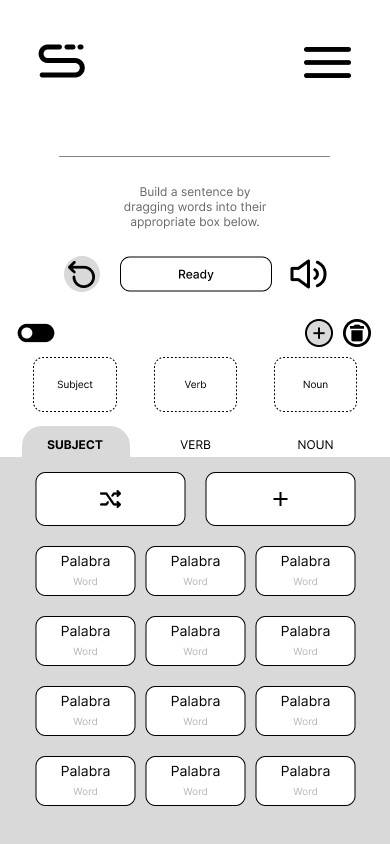
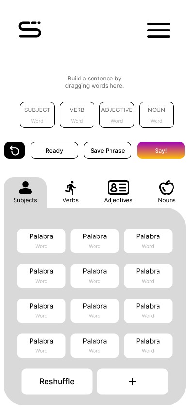
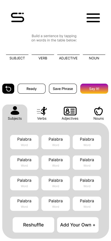
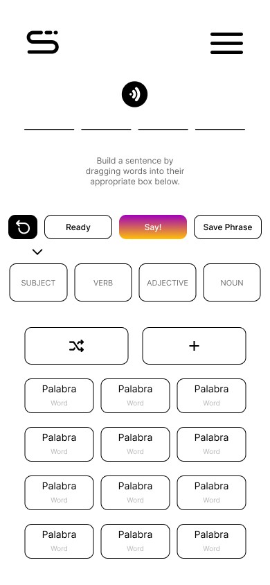
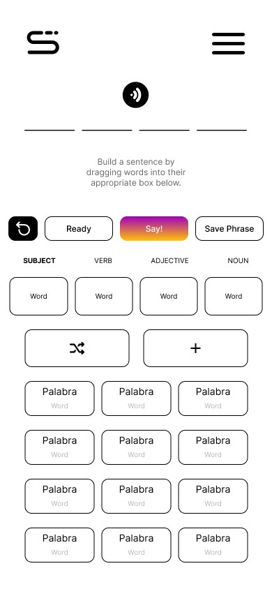
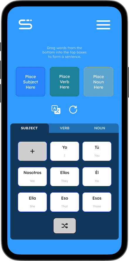
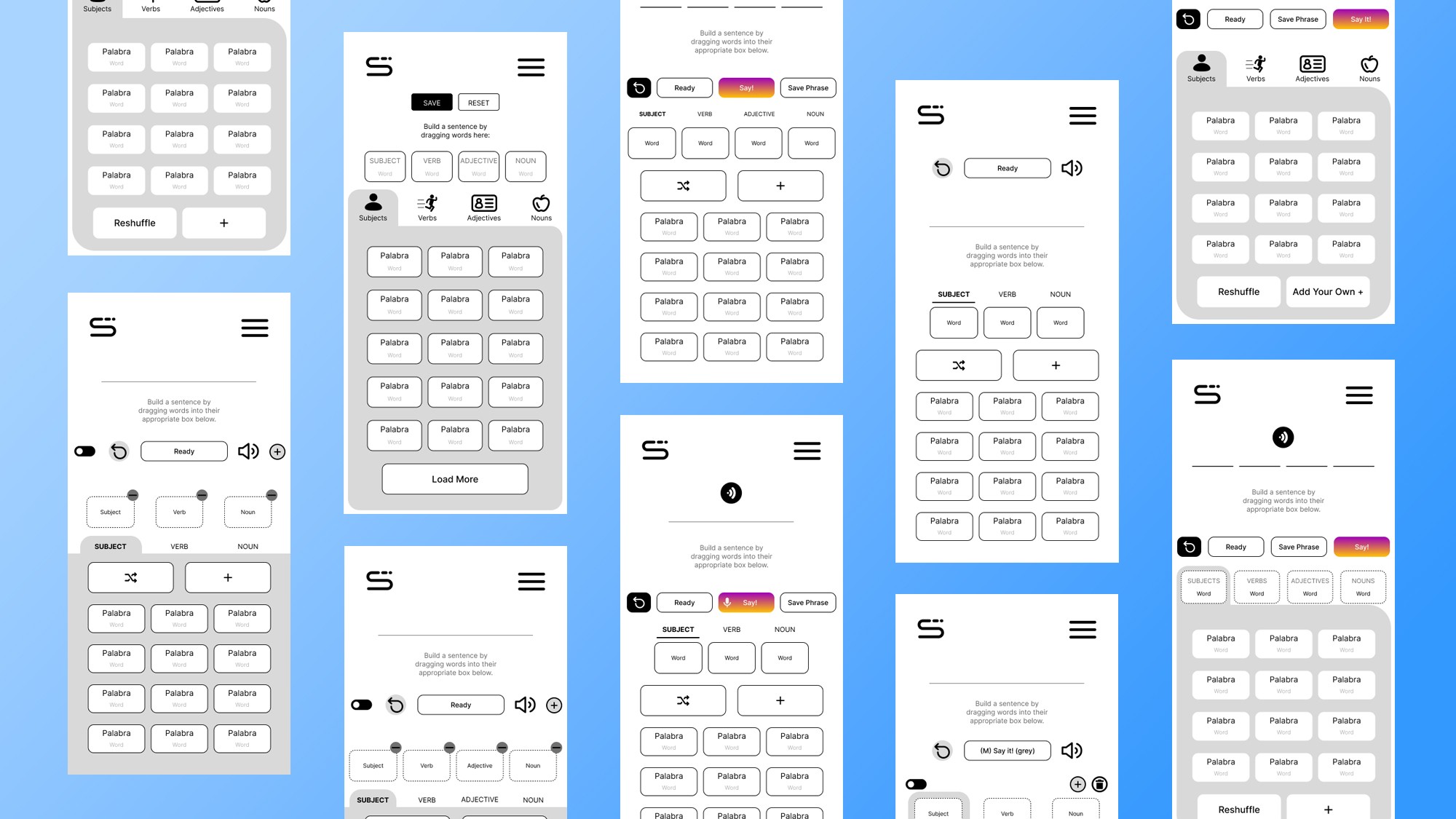
The most important task for me was how the sentence building page was going to be designed. Diego informed me about the idea of a building block-like structure that allows the user to pick a word from a selection menu, and place them into their respected boxes. The user will do this for a subject, a verb, and then a noun to complete their sentence.
Iterations
The design hierarchy of the sentence builder took on many different forms and iterations. Most the ideas revolved around the user picking a selected choice of words. Along with additional options of shuffling the word boxes, or manually adding a word of their own.
Design Choices
Starting out with the landing page and language selector, I dove into research on what language apps already exist. With this, I took inspiration from successful language learning apps such as Duolingo, Busuu, and Rosetta Stone.
By understanding the competition and how their information architecture is structured, it led me on bringing Say! into the right direction of familiarity and ease-of-use for our users.
User Testing
We conducted a number of user testing to best identify what worked within the sentence builder and what didn't. We received tons of helpful feedback from one user, who happened to be a foreign language professor. The feedback received pushed us to a better direction, overall helping us redefine Say's usability and experience.
"an English translation toggle can be very convenient during this stage, it should help challenge the users or those who are more skilled in the language."
"Those who are more fluent in a language may not want to start their sentences off with a subject, how can we give them the freedom to change up the structure?"
Final Design
Introducing "Say"
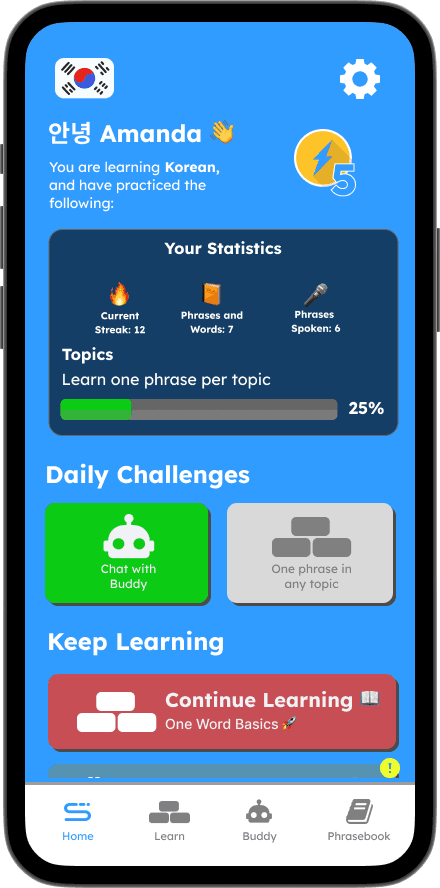
The homepage tailored to the user's progression and activities, with statistics, daily challenges, and other points of interests that keeps the users excited and focused on practicing new languages.
Getting Started
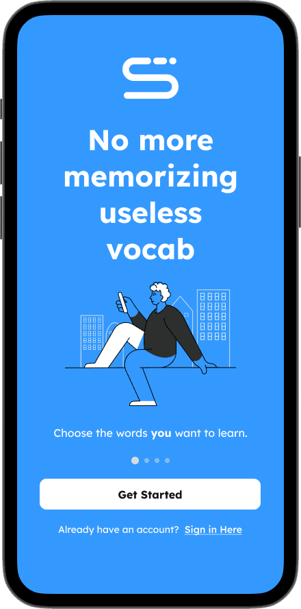
Say! introduces itself to the user showcasing what exactly it has to offer.
Login / Signup
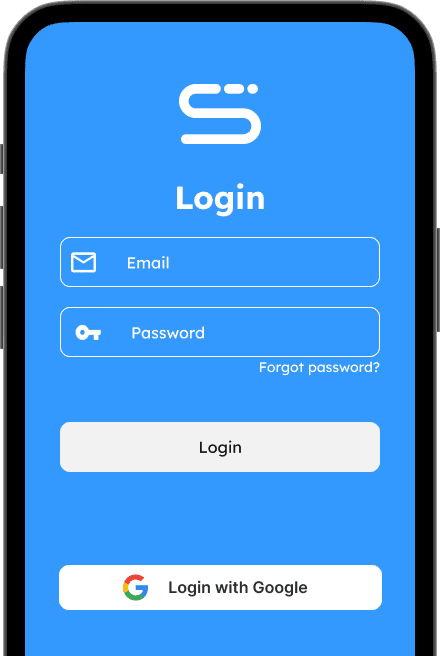
The user is able to login with their email or they can login using their Google account.
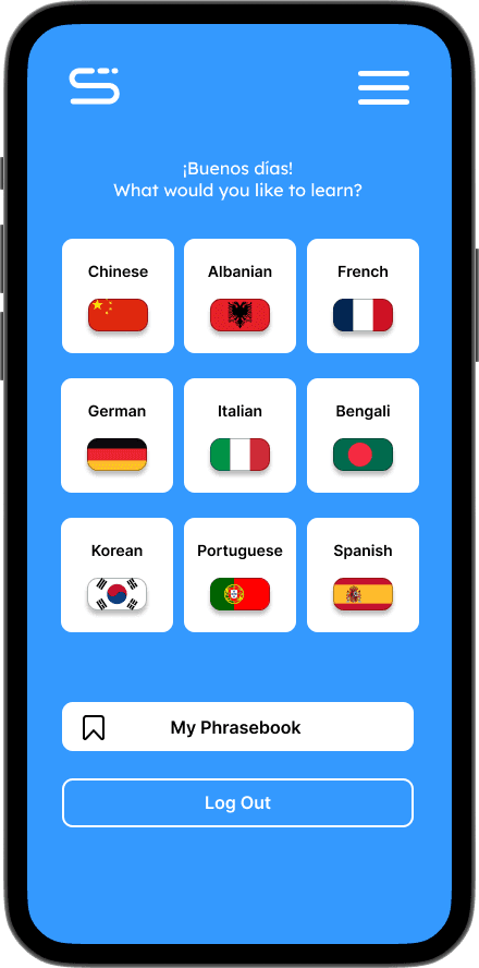
Choosing a language
Say! provides a variety of languages the user can choose from. They can either get started on learning a new language, or they can access their phrasebook.
Say's homepage.
The homepage tailored to the user's progression and activities, with statistics, daily challenges, and other points of interests that keeps the users excited and focused on practicing new languages.
User Statistics
Users can view details about their app usage, including how often they use it, the phrases and words they've saved, and the total phrases they've practiced.
Daily Challenges
Be challenged with daily sentences to speak, or spend time chatting with the AI assistant.
Energy Spheres
Energy Spheres are used to power and continue communicating with the AI. 1 sphere equates to 10 messages!
Save and Learn For Later
Completed phrases and sentences can be stored in the user’s phrasebook. Saved content can be practiced and edited.
Say's Design System

